Ultimate Guide to Inlay Card Tips for Effective Design
inlay cards are a powerful tool for effective design. They enhance the visual appeal of products and provide essential information. However, designing an inlay card can pose challenges. It requires a balance between aesthetics and functionality.
One must consider the choice of colors, fonts, and images. Too many elements can make the design cluttered. On the other hand, minimalism might leave important details missing. Finding that sweet spot is key.
When designing inlay cards, think about the target audience. Their preferences matter. Often, designs that resonate with users yield better results. Reflect on past designs and identify areas for improvement. Learning from mistakes helps refine future projects. With careful thought, inlay cards can become compelling marketing tools.
Understanding the Basics of Inlay Card Design
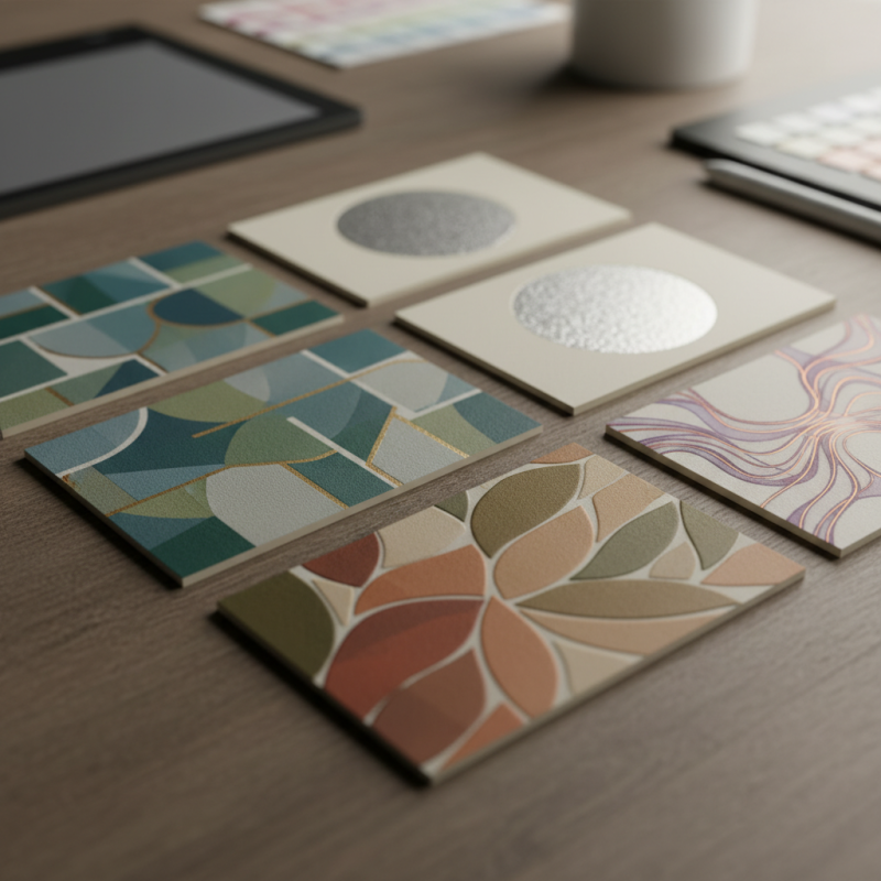
Inlay card design blends creativity with functionality. To create an effective inlay card, one must understand the importance of layout and visual hierarchy. A study revealed that 80% of consumers prefer clear and organized information. This finding highlights the need for a clean design that guides the reader's eye through the content smoothly.
Color choices matter significantly. Research shows that color can boost brand recognition by 80%. However, using too many colors can confuse. It’s important to stick to a limited palette. This helps to maintain visual appeal. Experimenting with typography is also crucial. Using two complementary font styles can improve readability. Yet, it’s easy to overdo it. Too many fonts can make a card look chaotic and unprofessional.
The card's material should not be overlooked. Studies indicate that tactile elements influence consumer perception heavily. The texture and weight of the card can affect how the message is received. Sometimes, a glossy finish may enhance the design, while in other cases, a matte surface could work better. Reflecting on these details can elevate the effectiveness of inlay cards, allowing designers to connect with their audience more deeply.
Inlay Card Design Trends - 2023
Key Elements of Effective Inlay Card Layout
When designing an inlay card, the layout is crucial. A well-structured card can boost consumer engagement significantly. A study by the Packaging Association found that 45% of consumers prefer visually appealing packaging. Using clear typography enhances readability. Keeping text concise is key. Aim for a balance between imagery and information.
Color plays a vital role in design. Research indicates that colors can influence buying decisions by up to 85%. A thoughtful palette can evoke emotions and create brand recognition. However, too many colors can confuse the viewer. Strive for simplicity but remember that creativity is essential. Experimentation can lead to unexpected results.
Incorporating ample white space helps focus attention. A cluttered design overwhelms the user. Yet, some designs miss the mark by being overly minimalistic. Consider feedback from test groups to adjust layouts. Iterative designs often improve effectiveness. Small tweaks can make a big change in consumer response.
Choosing the Right Material for Your Inlay Cards
When selecting materials for inlay cards, it’s crucial to consider durability and design appeal. A study from the Packaging Strategies Report indicates that 70% of consumers judge a product by its packaging. This means the choice of material can significantly impact customer engagement.
Consider using wood veneer or recycled paper. Wood tends to be more visually appealing and feels premium. On the other hand, recycled paper is eco-friendly, appealing to the growing number of environmentally conscious consumers. Research shows that 55% of shoppers prefer brands that prioritize sustainability. However, wood can overshadow simpler designs, resulting in mismatched aesthetics.
Testing different materials is essential. Some might not hold up well in certain printing conditions. A report by the Material Innovation Lab highlights that 30% of designs fail due to improper material selection. It’s important to prototype and get feedback before finalizing anything. Experimenting isn't just innovative; it’s a necessity in design. Consider integrating texture or color variations to enhance tactile appeal. Choices you make today could steer future design trends.
Color Theory Principles for Inlay Card Design
Color theory is a crucial aspect of effective inlay card design. Understanding how colors interact can improve visual appeal. According to studies, the right color combinations can increase engagement by 80%. When designing inlay cards, consider the emotional responses colors evoke. Warm colors like red and yellow can stimulate excitement. Cool colors like blue and green often convey calmness.
However, not all color pairings work. Overusing vivid colors can overwhelm the design. In a recent report, it was found that 45% of consumers prefer simpler designs. This implies that subtlety can often be more powerful than vibrancy. Balance is key. Include contrasting colors to create focus points. For example, pairing a bright orange with a muted gray can draw attention while remaining elegant.
Selection is also critical. Color accessibility matters significantly. Nearly 8% of men and 0.5% of women are colorblind. Designing with inclusive colors can reach a broader audience. Test designs with various users. This ensures the colors resonate with different viewers. Always seek feedback and be prepared to adjust choices. Even industry leaders experience missteps in their color selections. Learning from these moments is essential for improvement. Consider how each choice impacts the overall message of the inlay card.
Common Mistakes to Avoid in Inlay Card Creation
Creating an effective inlay card requires attention to detail. Many designers overlook common pitfalls, leading to less impactful designs. A frequent mistake is using subpar images. Blurry or low-resolution graphics can ruin the overall effect. Always select high-quality visuals that fit the theme and message.
Color choices are another area where mistakes happen. Clashing colors can distract viewers. Testing the color palette is essential. Use mock-ups and get feedback. Sometimes, the colors you love may not resonate with others. Take time to assess how they work together.
Textual elements should also be carefully considered. A cluttered layout often makes cards hard to read. Keep your fonts simple and legible. Limit the amount of text. Remember, less is often more. A stark card can feel more elegant than one overloaded with information. Make sure your design communicates clearly.

 Skip to content